This summer, I designed a lesson plan using TimeMapper for the Department of Rhetoric & Writing’s First Year Writing course, which is primarily taught by graduate student instructors in their first year as an instructor of record. They are provided with an ‘Instructor Guide’ which, alongside other resource, contains day plans for each class over the course of the semester. The TimeMapper lesson plan was one of three explicitly digital plans written for the instructor guide. The lesson plan is accompanied by a number of digital publications, which I designed and developed to both support the current RHE306 curriculum and remain relevant in later years as the course theme changes.
The lesson plan, discussed in greater detail elsewhere, asks students to work individually or in small groups to create a single class-wide timemap of an issue or event related to the course theme — in 2015-16, Race & Criminal Justice — and is designed for digital classrooms. However, it’s readily adaptable to BYOD classes — since TimeMapper is a web app, it works across platforms — and other course themes.
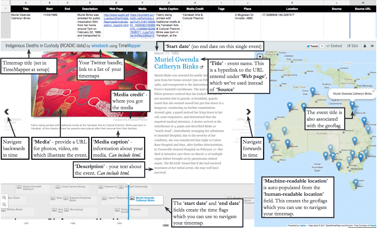
The first publication is a sample TimeMap and its accompanying data. I published both the front- and back-end of the TimeMap so that students would have access to both a finished project and the Google spreadsheet from which the timemap is drawn, allowing them to see more clearly the relationships between data and display, and to explore the affordances of this tool. I chose to map the data from the Australian Royal Commission into Aboriginal Deaths in Custody, which investigated the deaths in custody of 99 indigenous Australians between 1980 and 1989. I read the narratives accompanying each case and synthesised them into a brief account of the individual’s life and death, entering my composition and the accompanying facts — time and place of death — into the Google spreadsheet that feeds the TimeMap. The TimeMap is both a demonstration and itself a rhetorical project: the list of deaths doesn’t demonstrate the national scope of the issue near so well as a map showing deaths in every state and territory in Australia.
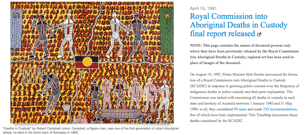
This topic selection posed some logistical problems. Most Australian indigenous traditions forbid visual representation of the dead, but the TimeMapper format is dependent on an accompanying picture; I selected artwork by indigenous artists living or working in the deceased’s area to accompany each note. I also created a ‘landing page’ of sorts by adding a date ahead of the most recent RCADIC case which explained the representational choices I’d made: no images of the deceased, and their names only where they had been previously released publicly (below).
 The TimeMapper algorithm, reliant on the OpenStreetMaps API, is supposed to take human-readable place names and convert them into machine-readable latitude-longitude coordinates. At the time I began work on the TimeMap, the algorithm could return coordinates for major cities and regional centres in Australia, but could not locate the remote communities in which many of these deaths took place. As such, I used Google Maps to determine coordinates for many of the sites and entered them manually. Since beginning the project, the algorithm has broken completely, with the result that I need to manually enter the full set of coordinates.
It also took awhile to figure out formatting. The TimeMapper documentation doesn’t say anything about support for rich text formatting, even though this is available within the Google ecosystem. I found that it didn’t read native formatting from the spreadsheet, but did accept html input — although this isn’t listed in the app’s documentation. I highlighted this in the handouts discussed below, as it makes an enormous difference to the legibility and visual appeal of the finished TimeMap, as well as allowing you to provide external links to support your text and participate in larger conversations.
The second digital publication associated with this lesson plan is a series of one-page handouts for both instructors and students. These include tutorials for instructors and students creating TimeMaps from scratch, instructions for students whose instructors are following the lesson plan as it was written, and a guide showing the relationship between input data and output visualization. (These are links directly to the PDFs; you can also download all three handouts as a single PDF.)

These handouts were designed with reuse outside the context of the 2015-16 RHE306 curriculum in mind, speaking in generalities and in the main, using closely cropped screenshots to indicate technique rather than content. They have already been used in other DWRL classes and I anticipate that, following their publication on the DWRL website, they will circulate outside UT (they do include one piece of UT-specific information, a recommendation that users take advantage of UT’s site license for LYNDA html tutorials).
Because the RHE306 instructor guide is circulated in hard copy, I created these tutorials using InDesign and provided them to the Department of Rhetoric & Writing as PDFs. They were produced in colour to allow for online circulation, but I minimally edited the included screenshots for contrast to ensure they would reproduce clearly in black & white, both in the instructor guide and when users photocopied them for circulation to students.
I drew intensely on my past work in publishing to create these handouts. First, I had a little bit of formal training and a lot of hands-on practice with InDesign during my media career, which I have since built on through independent projects (this has also provided a strong foundation in learning to use other programs in the Adobe Creative Suite). Second, I spent a lot of time working with designers and technical editors to create good tutorials, since the publications I oversaw contained patterns and instructions for a broad variety of craft projects. The economics of publishing are such that a lot of information has to be squeezed in between the advertisements — that practice of getting the most information across in the smallest space was great preparation for composing these handouts as single-page PDFs as, even after condensing the instructions as much as possible, I struggled to get everything on a single page. (O for the wide-open spaces of a web tutorial … but barring that, two columns gets you more tutorial than one.)